Personally, I found choosing the external colours a lot harder than choosing the internal colours. The front of our house is different to the display home. Therefore, I find it difficult to imagine what it is going to look like, let alone visualise it painted with the colours suggested by Ventura’s consultant.
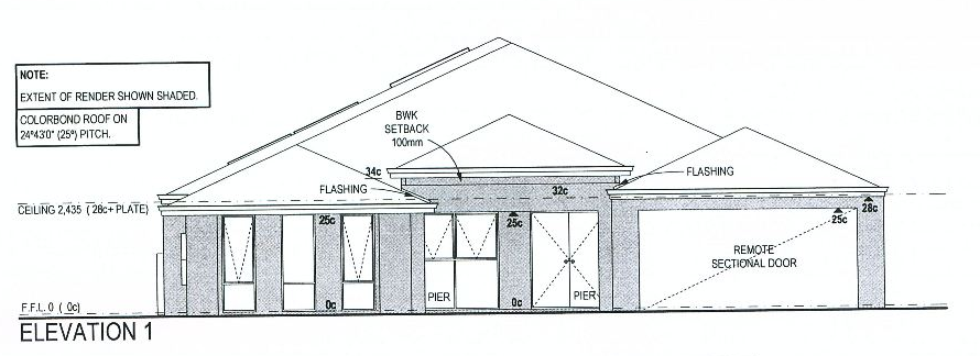
To help with my visualisation issues, I scanned the plans for our front elevation and created a “black line master” using Microsoft Paint, which I could then colour in when we got home.
 |
| "Black Line Master" for our version of the Rendezvous |
If you would like me to make a tutorial on how to do this, feel free to ask via the comments section.
The exterior component of our colour consultation revolved primarily around the front elevation. We decided to choose varying shades of grey for the render and metalwork. Ventura’s colour consultant said this would help to tie the outside areas with the inside areas as it keeps with the white, grey/silver, black colour scheme used for the interior.
Prior to the meeting, the only shade of grey we had decided upon was the colour of the roof. Choosing the roof colour was easy; there were plenty of examples to look at during our daily commute.
The colour we chose was Windspray. We wanted a colour that was dark enough so that it would not look dirty during the winter, but not so dark that it would absorb of heat during summer.
Tip: If you are interested in thermal efficiency, the Colorbond website lists each of their roof colours along with the associated thermal classifications.
Thanks to our sales consultant Mike Tanner, we received a free upgrade to Colorbond guttering and downpipes (much appreciated!). This meant that the majority of colour selections came from the Colorbond colour pallet. We decided to continue this trend by choosing a render colour from this pallet also.
The colours that were chosen for the front elevation were Surfmist, Windspray and Monument. These three colours are very modern. The consultant recommended arranging them as follows:
 |
| Exterior colour scheme as suggested by Ventura’s colour consultant. |
This colour scheme is not for the faint hearted due to the high level of contrast between the light main render and the dark project render and portico infill. It was not until I had created the above image that we realised just how light Surfmist is. We wanted a light grey house with a grey roof and dark gutters. Therefore, we decided to change the main render colour to Shale Grey.
Based on this new colour trio, we set about colouring in our “Black Line Master.” We managed to narrow the options down to the following two colour schemes:
 |
| Option One: Retain the bold highlights. |
 |
| Option Two: Remove the bold highlights |
In the end, we decided to use the more conservative Option 2. Therefore, our finalised external colour selection appears as follows:
Windspray
 |
- roof;
- facia;
- portico infill;
- front door; and,
- garage door
|
|
Monument
 | |
|
Shale Grey
 | - main render
- project render
|
|

Update (08/08/2011): Silly me forgot to mention what colour pavers we will be using for our driveway. If you had not guessed already, we will be using charcoal with a grey border.