Showing posts with label Milestone. Show all posts

Sunday, June 10, 2012

Update - Lockup

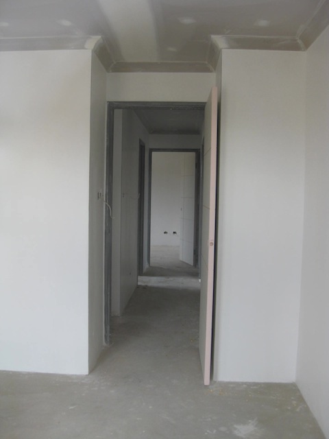
Arriving on site and fining your house locked up is a wonderful, yet disappointing feeling. We were not exactly sure when lockup would occur due to the heavy rain we have been receiving for the last two weeks. It looks like the weather has not held us up at all. I now find myself figuring out new ways to photograph the house, using door knob holes and squeezing the camera in through open awning windows.

As far as the schedule goes, sanitary-ware is being fitted on Monday and the cabinets go in on Thursday. We have not heard anything about our tile meeting yet. I assume it is happening soon?


Hallway as seen from my room

Guest bedroom. Love those doors!

The font entrance hall, as viewed through the door knob hole.

Lockup! Nothing like seeing a pair of aqua doors

Lockup, viewed from the left side

Wednesday, September 7, 2011

Finally, The Final Plans

We have the final drawings and everything is looking good. The picture recess and the cavity sliding door are now drawn correctly.

As requested, here is the floor plan in a more readable size:


Thursday, August 18, 2011

Final Plans Have Arrived!

We have plans!
Just a quick note for today, we have finally received our final plans! Well near final, there was one thing that did not end up working out how we wanted.

The plans took four weeks to draw, as opposed to the standard two week lead time. I am not too worried about this. We made a lot of changes, so I think it is fair enough.

I will be posting individual parts of the plan over the coming days. There is a lot to go through, but overall we are pleased with how it has turned out.

Tuesday, July 26, 2011

Milestone: External Colour Selection

Personally, I found choosing the external colours a lot harder than choosing the internal colours. The front of our house is different to the display home. Therefore, I find it difficult to imagine what it is going to look like, let alone visualise it painted with the colours suggested by Ventura’s consultant.

To help with my visualisation issues, I scanned the plans for our front elevation and created a “black line master” using Microsoft Paint, which I could then colour in when we got home.

"Black Line Master" for our version of the Rendezvous


If you would like me to make a tutorial on how to do this, feel free to ask via the comments section.


The exterior component of our colour consultation revolved primarily around the front elevation. We decided to choose varying shades of grey for the render and metalwork. Ventura’s colour consultant said this would help to tie the outside areas with the inside areas as it keeps with the white, grey/silver, black colour scheme used for the interior.

Prior to the meeting, the only shade of grey we had decided upon was the colour of the roof. Choosing the roof colour was easy; there were plenty of examples to look at during our daily commute.

The colour we chose was Windspray. We wanted a colour that was dark enough so that it would not look dirty during the winter, but not so dark that it would absorb of heat during summer.

Tip: If you are interested in thermal efficiency, the Colorbond website lists each of their roof colours along with the associated thermal classifications.

Thanks to our sales consultant Mike Tanner, we received a free upgrade to Colorbond guttering and downpipes (much appreciated!). This meant that the majority of colour selections came from the Colorbond colour pallet. We decided to continue this trend by choosing a render colour from this pallet also.

The colours that were chosen for the front elevation were Surfmist, Windspray and Monument. These three colours are very modern. The consultant recommended arranging them as follows:

Exterior colour scheme as suggested by Ventura’s colour consultant.


This colour scheme is not for the faint hearted due to the high level of contrast between the light main render and the dark project render and portico infill. It was not until I had created the above image that we realised just how light Surfmist is. We wanted a light grey house with a grey roof and dark gutters. Therefore, we decided to change the main render colour to Shale Grey.

Based on this new colour trio, we set about colouring in our “Black Line Master.” We managed to narrow the options down to the following two colour schemes:

Option One: Retain the bold highlights.


Option Two: Remove the bold highlights


In the end, we decided to use the more conservative Option 2. Therefore, our finalised external colour selection appears as follows:


Windspray


  • roof;
  • facia; 
  • portico infill;
  • front door; and, 
  • garage door
Monument

  • gutters

Shale Grey

  • main render
  • project render


Update (08/08/2011): Silly me forgot to mention what colour pavers we will be using for our driveway. If you had not guessed already, we will be using charcoal with a grey border.


Friday, July 22, 2011

Milestone: Internal Colour Selection

When it came to interior colour selection, we decided to keep things simple by selecting the same colours and materials throughout. This may seem a bit boring at first, but it allows us to accessorise each room individually, whilst maintaining a common feel between rooms.

We decided the best place to start making our selections was the kitchen. Typically, the kitchen is a home’s central gathering point. This is especially true for us. We love to host large dinner parties, where we spend all night sitting around the dining table. Therefore, it is crucial that we get the colours right!

Our current kitchen is quite small. It has silver cupboards, which look fantastic. However, we felt using a feature colour, such as silver, in a much larger kitchen would be over powering. We decided to play it safe and chose white cabinets - “Classic White Sheen” melamine by Polytec.

Choosing a bench top colour was not as straight forward as choosing the colour for our cabinets or kickboards.

Paired with the silver cabinets of our current kitchen, is a lovely black granite bench top. Despite the “extra work” to keep it clean, we would have loved to continue this trend into our new home. Fortunately/unfortunately, our builder supplies Essastone and we decided that it would be best to stick with that.

To be honest Essastone does not wow me. The current Essastone range has three colours that would suit our white/grey/black colour scheme: Carbon, French Black and Midnight Rendezvous.

The winning colour, by elimination, was Carbon. If it were not for the large black flecks in the French Black, it would have been the likely choice because the base colour complements our floor tiles. Midnight Rendezvous, unfortunately, would have left us longing for our current black granite bench tops. Essastone just does not have the shine, depth or warmth that granite has.

Kitchen Colour Scheme: floor tile,
bench top, cabinet and kickboard
Unfortunately, our budget did not extend to having Essastone bench tops in the Laundry. For this room Ventura’s colour consultant recommended using Laminex Basalt (Natural Finish) for the bench top, as it is the best match for Essastone Carbon.

Our final colour choice for the day was kickboard colour. Our colour consultant suggested brushed aluminium. In theory this would have looked great, however when paired with our chosen floor tiles, an aluminium kickboard became lost.

We decided to choose a darker kickboard. We did not want to be so bold as to choose black kickboards, so we opted for Laminex Charcoal (Natural Finish).

It is always a good idea to take samples of your kickboard, cabinet and bench top colours when you go searching for tiles. If we had not done this, we would not have realised that brushed aluminium was too light a colour to use for kickboards.

Another interesting observation was the influence of our tiles on Charcoal kickboards. When paired with white, Charcoal appears to be dark grey in colour. However, when paired with our floor tiles, it appears more blue.

Thankfully, this does not cause a problem in our colour scheme, however it is something worth keeping in mind, especially if you are choosing a more specific or bolder colour scheme than we are.
Monday, July 18, 2011

Milestone: Colour Selection (Overview)

In early May, we met with Ventura's colour consultant for an hour-long colour selection/consultation. I am glad Ventura offered this service free of charge and prior to Pre-Start. I would have hated to choose our colours during Pre-Start because it would have added another hour to what ended up being a very long meeting.

Choosing your colours can be mind-blowing, especially if the builder's terminology is unfamiliar. I knew what a gutter and a fascia were, but I was unsure when it came to “portico infill” and the difference between "project render" as opposed to "main render".

Tip: If you are unsure of the terminology used during your consultation, ask your consultant to label them for you.

The different areas of a Rendezvous' front elevation.


Once you have gotten your head around the different names for each part of your house, so that you are able to visualise what it looks like, you are then free to address the actual colours.

When we built our apartment, we had a choice of four pre-established colour boards. It was easy to point to one of the boards and say “that one.” We selected a “modern” board with white walls, silver cupboards, grey carpet, and a beautiful black granite bench top.

We have decided to stick with the general white, silver/grey, and black colour scheme that we used for the apartment. This scheme is quite versatile. It allows us to brighten the place up using different coloured artwork, pillows, and rugs, which we can change depending on our moods or the season.

Choosing the correct colours for your home is very important, if you get it wrong, fixing it can become a very expensive exercise. There are numerous websites on interior decorating and the theory of colour. Personally, I find these websites offer more information than is needed. For me, it was a case of information overload.

Odds are while you are looking for inspiration when designing your house, you will start to get an idea of what colours you like and how they work together.

A friend of mine, Brad, offered some good advice: When looking at display homes, remember to look at the interior and exterior colour schemes. Generally, the salesperson will be able to tell you what colours they been used, or in the very least find out for you in exchange for your email address.

What advice have you been given?

Thursday, July 14, 2011

Milestone: Tile Selection (Part Two)

In my last post, I wrote about the tiles we chose for our house. One would think that tile selection is nearly complete once you have decided amongst yourselves which tiles you like and where you want to put them. Oh no, it is not that simple. Nor is it something you can do in a hurry.

Part two of tile selection begins when you call the assistant over. This is not as short a process as you might think. I recommend taking all of your plans with you when you go to make your tile selection. The consultants can be quite knowledgeable and can offer plenty of good advice, especially if you are planning to use feature tiles, so it pays to be able to show them the various views for each room.

When you sit down with the consultant, a form is filled in that lists each of the rooms to be tiled, which tiles you wish to use, the direction in which they are to be laid, their price and what grout will be used.

When I thought of grout, I thought it was black, brown, or white. How wrong I was. Grout comes in many different colours and shades; different grits depending on whether you have selected a rectified or cushioned edged tile; and, can have additives such as flex agents.

Your tile consultant will take care of the flex and grit choices, but you will need to do another round of colour choices. We decided to keep things simple by choosing grout colours that best matched the colour of the tiles. For our “snowy white” wall tiles, we chose an “ultra white” grout and a “charred ash” grout for our feature ensuite wall tiles.

Our beloved floor tiles were a pain to colour match, as they seem to be a brown-grey-blue colour. Eventually we chose “charred ash.” It was slightly lighter than the colour of the tile. We are not great fans of grout lines, so hopefully choosing a grout colour a shade or two lighter than the tile, will help the grout lines to blend and not be so obvious.

Our tile consultation took about an hour. Make sure you ask your consultant plenty of questions, especially if you are mixing tile sizes and edge types. One of the best tips we were given was “to ask our builder whether we can pay any costs over our allotted allowance directly to the tile store, so that we can avoid paying the builder’s mark-up.” Thankfully, Ventura already operates this way.

Saturday, July 9, 2011

Milestone: Tile Selection (Part One)

Choosing the right tiles was a tough one. Most of the display homes we visited seemed to favour light coloured flooring in order to make the house look bigger. Light flooring is lovely, however, we also loved the dark floors favoured by images of “designer homes” that we saw online.

Light floor or dark floor? The answer changed daily.

In the end, we left the tile selection to chance. We were at the mercy of the tile store displays. All we knew is that we were looking for either a light grey/white tile or a dark grey/black tile. It appears that brown is in vogue, and this narrowed our selections greatly. Who would have thought it hard to find grey tiles? Thankfully, the fourth tile store we visited had something that we both liked.


Marmo Royal by Ceramica Monica
The winning tile is “Antracite” part of the Marmo Royal series by Ceramica Monica.

Marmo Royal is one of the few series of tiles we found, which offers both 300 x 300 mm and 600 x 600 mm format tiles. This allows us to have matching tiles in both the main and wet areas. This really appeals to me.

I remember seeing a display home in Piara Waters, which had 600 x 600 mm tiles in the main areas and matching 300 x 300 mm tiles in the wet area. It looked stunning. The tiles flowed from room to room and brought each part of the house together. I loved it!


Once we had our floor tiles sorted, it was onto the wall tiles. Like many people, we chose a 300 x 600 mm white tile for our bathroom. You cannot escape the allure of clean, white, bathroom tiles. Unlike many display homes, we did not choose a feature mosaic tile.

Our bathroom is small and narrow. To put a feature tile on one of the walls would be overpowering. In an attempt to make the room look longer, we will be laying our white wall tiles horizontally and using the floor tiles to tile the bath hob.

Ensuite Colour Scheme:
floor tile, feature wall tile
The ensuite, however, is a completely different matter. It is huge! For this room, we have chosen a solid colour feature tile for the back wall. Like the wall tiles, it is a 300 x 600 mm format tile.

Unfortunately, this tile store did not have a large selection of solid colour feature tiles (but they did have an amazing selection of mosaics!). Given the available selection, we chose a matt blue-grey tile. I would have preferred to use a dark charcoal/grey tile as the feature, but unfortunately, they did not have one in the correct size/colour.


As for the rest of our tiles, the laundry splashback will uses the same white tiles as the bathroom wall and we have deleted the kitchen splashback tiling so that we can install a glass splashback after handover. I have my heart set on either a black or bauxite splashback.


Speaking of the kitchen, it is worth selecting your kitchen kickboard colour at the same time as you choose your main area floor tiles. It is amazing how colours can seemingly go together in your mind, but looks completely wrong when you bring them together.

Tip: Most manufacturers offer free samples via their website. Even though you will find the tile stores already have samples, I found it useful having my own, so I could test the different colour combinations at my leisure.

Thursday, June 23, 2011

Milestone: Land Settlement

After a few hiccups with the ash cloud causing delays with our bank being ready for settlement (nearly 1 week overdue) and fears of late fees, our block has finally settled!

Late 2010, we secured a lovely little 17 x 32 metre (560 square metres) block of land in a new estate north of Perth. It seems small compared to 800+ square metres on which I grew up. Apparently, there will be some parks nearby with walking and cycle paths, so the dogs should not be too upset with having a smaller backyard if they get to go explore these paths daily.

House wise, this block is a reasonable size. It would have been nice if it was 18 meters wide, but 17 meters will do. It does not leave much space up the sides of the house. At the narrowest, there is 1.2 meters to the fence. I hope that it will not be too narrow a space to install a gate through which I can wheel the rubbish bins.

Our block showing the proposed position of the house


A month ago, we visited out to the site to take a few happy snaps of our block to be. We were pleased to see that we have a reasonably clear frontage, apart from a public footpath. Our neighbours, to the left and right, each have a storm drain.


Front view: The bushland you can see behind, I believe, is going to be part of a park.


Side view: You can see how the blocks are stepped; it should add some character to the street.


I cannot wait to taking photos of our house as it is being built.

Tuesday, June 14, 2011

Here we go .....

Welcome! At the beginning of this year, we put a deposit on a lovely 560 square metres of blank canvas upon which to build our new home.

So far, it has been a wonderful, yet stressful experience. I have learned so much and still have so much to learn. I hope that I will be able to use this blog to share some of that with you.

The design we have chosen is based on the Rendezvous, by Ventura Homes. We walked through so many display homes, looked at every online house plan offered by every affordable builder in our state and it was the Rendezvous that "Wowed" us. The house seems normal until you walk into the living area and the whole rear of the house opens up in front of you. I am really looking forward to hosting dinner parties in this huge area.

We have made a few changes; the most substantial was the extension to the alfresco area and remodelling of the bathroom, ensuite and powder room. Its amazing how one little change can cause so many knock-on-effects. For example, if you change from semi recessed basins to counter top, you may need to increase the depth of your vanity, move the taps to wall and add a splash back (as opposed to extending the mirror to the counter top - I love this look). It is all simple stuff, just a lot to think about.

We had pre-start last week. Wow, is all I can say. It took nearly six hours to go through all of the "little" changes we wanted to make. If anyone reading this is about to go to pre-start, I have some advice:
  • Write down every change you want to make/enquire about prior to your meeting and tick them off as you go. It is amazing how easy it is to start to forget things, or think that they don't matter when you have been sitting there for 4+ hours;
  • Make sure you get a good night's sleep, and if it helps, take pictures with you, especially if you are doing something a bit "out of the norm";
  • If you are supplying your own basins, tap ware, appliances etc, where possible bring a technical drawing to your meeting, as it is likely that they will ask for it. For more obscure items, you might want to provide an installation guide as well; and,
  • Make sure you ask for copies of everything! I can almost guarantee that you will wake up in the middle of the night and wonder if you remembered to add all of the power points.
Related Posts Plugin for WordPress, Blogger...