Friday, September 30, 2011

Tools - SweetHome3D

Unless it is an apartment or other tightly strata managed property, home building is never a cookie cutter affair. Homes by nature are as individual as those who live in them. Whilst you can look at a plan and say that is a Rendezvous by Ventura, or a Monarch by National Homes, or a Nautilus by Dale Alcock Homes, you will always find differences between the base plan and the finished product.

Example 2-D sketches created
using Microsoft Paint.
Our Rendezvous has definitely been personalised. We have moved built in robes, extended the kitchen and alfresco areas, and completely re-designed the wet areas.

When we initially began changing the plans, we used Microsoft Paint to edit a picture of the standard plan that we downloaded from Ventura’s website. This method is not precise, because the image we were working with was not to scale.

Despite these limitations, the above method is an excellent tool for recording our ideas. It was helpful to be able to take these pictures to our first sales meeting. Being able to show someone your ideas is always easier than trying to describe them. I have continued this trend whenever we need to communicate ideas to the builder.


Once you have scale plans, you are able to start looking at the specifics of home design, such as the size and placement of windows, kitchen and bathroom cabinet configurations, size of the shower recess, etc.

At this point, we outgrew Microsoft Paint and needed to find a proper home design package. Some people may think that creating a 3D model was overkill. Initially I would agree, but it has been invaluable because it has helped us to avoid last minute variations and unnecessary changes. Obviously, the more changes you made to the original plans, the more important a 3D model becomes.

For example, earlier I posted about our shower screen dilemma. The builder’s suggestion to add a small wall seemed a good idea in theory, especially as it would have allowed us to have a hidden recess for shampoo and soaps; however, it was a significant deviation from our original design.

I do not know about you, but when someone who has been doing this for a lot longer than I have makes a suggestion, I tend trust them more than I do myself.

If it was not for being able to visualise these changes by use of a model, we may not have decided to stick with our original design, even though that it required some legwork to find someone willing to install the shower screen after handover.


Our ensuite design showing the raised
areas and large shower screen


Screen capture from Sweethome 3D
showingthe 2D modelling view
and the 3D walk through view.

3-D render of our bathroom created
using Sweethome 3D
As an aside, having a 3D image of how we wanted our ensuite to look, helped immensely when looking for someone to install the shower screen. Trying to explain a bathroom with steps here, and raised areas there, is a lot harder than showing them a picture and saying “it looks like this”.

Home design software packages are plentiful. At this point in time I have far from scratched the surface of what is available. When I started looking for design tools, I was short on time. I needed a free package that was quick and easy to learn, which was capable of producing both 2D and 3D floor plans.


Whenever this topic arises, Google SketchUp appears to be one of the most popular answers. Whilst it is very powerful package, Sketch up was more I was looking for. Realistically, SketchUp is a CAD program, not a home design program.

On the opposite side of the scale is My Virtual Home. My Virtual Home is very user-friendly program that allows its users to rapidly create 3D models of their home design. Most of the people I speak to have used this program, and recommend it highly. Unfortunately, it drove me up the wall. I wanted a program that would allow me to enter precise dimensions and would not try to fix things for me. What I was looking for was something with the precision of SketchUp and the usability of My Virtual Home.


The solution to my problem was SweetHome3D. It allows you to:

  • draw straight, round or sloping walls with precise dimensions;
  • insert doors, windows and other furniture;
  • change the colour, texture, size, and orientation of furniture, walls, floors and ceilings;
  • simultaneously view your design in both 2D and 3;
  • annotate the plan showing room areas, dimension lines, and text; and,
  • create photorealistic images and video to export in a number of standard file formats
(For a full list of features visit: http://www.sweethome3d.com/features.jsp


The only real downside I have found to Sweet Home 3D is the inability to draw a roof on your home. For the most part, this did not bother me, as I was primarily interested in the house’s internal structure. The furniture models it comes bundled with are limited, but you can import a wide range from Google’s 3D Warehouse.


What software do you use to create 3D models of your home designs?

Monday, September 26, 2011

Inspiration - Homeone.com.au

Homeone.com.au has been an unending source of inspiration. I have learned so much in the short time I have been reading the forum. Everyone is willing to share (or show off) their homes, thoughts and experiences. One of my favourite threads is “show me your kitchen.” It is full of great kitchen photos and advice.

The people are lovely. They understand exactly what you are going through. Encouragement and advice is only one post away. There are no silly questions.

What I like most about this forum is that it is active, but not full of garbage. Aside from your standard question and answer threads, the forum also contains logs of people’s personal home building journeys. These logs are very informative, especially if it is your first time building because you are able to learn from other people’s experiences.

Your homeone journey does not end once your house is built. There are sections for interior decorating, landscape and garden design, renovations and extensions, DIY and home maintenance, and, home automation. These sections are equally as informative as the home building threads.


If you are building a home, or even debating over what style of window covering to buy, pop on over to Homeone.com.au and join the forum


P.S. If you are building a new home, make sure you read this thread, it is worth its weight in gold. When you are building your home, it is too easy to forget the little things. This thread acts to remind what not to forget.


homeone® - Australia's home building and renovation resource.
Australia's home building and renovation site since 2001. Plan your build, renovation or home improvement and find local builders, tradesmen and suppliers from the directory, read home improvement articles and discuss your project at the popular home building forum.

Thursday, September 22, 2011

Colour Dilemma - External Colour Selection

Just when we thought that we had reached the end of the "design and selection" tunnel, we have reached one more stumbling point - we have failed developer approval because we chose one colour for our front façade:

“A minimum of two materials or colours must be used in the primary street elevation (excludes windows and garage doors). “

To be honest, I do not see why the garage cannot be taken into account. Garage doors offer a significant contribution to a given house’s street appeal. This is especially so in those cases where it is painted in a feature colour or is constructed using a feature (expensive) material.


Our current external colour selection.
I can understand the developer not wanting the estate to appear boring, but I think they need to be careful, too many colours and materials can easily look tacky and become out dated.

Do you think our front facade is boring? I would have termed it conservative, perhaps a little ‘traditional' compared to some of the modern houses with lots of small square windows and architectural pillars. However you describe it, I just hope it does not become old fashioned.


If you were us, and were forced to add an additional colour to the front rendering of our house, what would you paint and what colour would you use? I have included a picture of our front elevation which has the different renderable areas marked, so that we are on the same page regarding terminology.

The various sections of our front elevation


So far, we have received the following suggestions (thankyou) from the lovely people at the homeone forum and Decorating Forum. What do you think?


Big shout out to mimi23, Anna and kdgirl. Thankyou for your suggestions!

Sunday, September 18, 2011

Inspiration - Retail Outlets

A gorgeous wall mounted vanity
display at Bathroom Décor and Tiles

A unique pairing of wall and floor
vanities at Clever bathrooms.

A mock bathroom display at
Primier Tile Gallery
Retail outlets are a good way to see the current trends and fashions in home fittings, fixtures and furnishings. In a previous post, I sang the praises of company showrooms. When looking for specific items, for example a freestanding bath, company show rooms are excellent as they can save a lot of running around and potential disappointment because a store does not have the item you are looking for on display. However, they tend to be quite drab and boring if you are visiting to get an idea of what style, colour, shape, size, etc that you like.

This is where retail outlets shine. Even though the range on display is restricted to a small number of manufacturers, the staff members spend a lot of time and effort presenting their stock in an innovative and stylish manner. The best example of this is bathroom stores.

A good deal of thought goes into matching the various shapes and sizes of basins, vanities and tap ware, so that it looks appealing. This can save you a lot of time, and give you some great ideas and show you combinations that you will not see in display homes. Wall hung vanities, vessel basins and freestanding baths are the first things that spring to mind. I do not remember visiting any display homes that had these features.


Bathroom stores are not the only ones who spend a lot of time on their displays. Tile stores are another example. Not only do they group tiles that go well together, you will commonly see mock bathroom scenes, designed to show you how the tiles look in a real world setting.


Being the "over researcher" that I am, I visited a number of kitchen stores looking for inspiration. Unfortunately, the ones I visited imported their cabinets from Europe. Unless you get your builder to remove all of your cabinetry, there is not a lot to gain by visiting these stores as compared to looking at photographs on websites such as Houzz.com.

Some of the displays at the Häfele showroom.
What I will recommend is asking your builder what kind of hardware their cabinetmakers use. In our case, it is Häfele. I did visit the Häfele showroom in Malaga to see what innovative products they had on display. This is one of the rare occasions where we decided to stick with the builder’s brands. If you have the money to spend, I do recommend it.


Unfortunately, for us a custom Häfele proved too expensive. I would have loved to install all sorts of pull out draws, shelves, and racks.

Wednesday, September 14, 2011

Selection - Basin

If there was one item that made one display home bathroom look like another, it was the basins. They were all fitted with two out of the four popular basin choices: square/round semi recessed, under-mount or round inset basin. 

$99 oval basins from
The Bathroom Outlet.
By now, you would have gathered that we want our house to be a little bit different to the standard cookie-cutter houses pumped out by the builders during the boom. Bathroom basins are one of the places where you can do this without obliterating you budget (assuming you do your homework and shop around).

When looking for a basin, one of the first things you notice is that the cost fluctuates greatly. A white ceramic vessel basin can cost as little as $90 and peak around $700. If you want something special and imported from Italy, you can easily pay over $1000. I found the majority were between $250-400, assuming you were not shopping in a boutique bathroom store.


Alpe White WT4 pedistal
basin from Reece.
When choosing a basin, a few questions that need to be answered:
  • How will you use it? For example, in a powder room where you are simply washing your hands, a shallow basin is perfectly adequate. If you are shaving, washing your face, cleaning your teeth, you may want to consider a deeper basin;
  • How will it be mounted? Do you love the look of pedestal basins, wall mounted ones, semi-recessed, vessel, under-mount, etc;
  • Do you want your basins to match? Some models of basin are made in different sizes so that you can have larger ones in your bathroom/ensuite and have a smaller one in your powder room; and,
  • What else should I consider? If you are looking at materials other than ceramic, you may want to consider whether the material is easily stained by hair dye, teeth whitening solutions, etc.
Glass basin from
Bathroom Warehouse
Once you have chosen your basin, there are another set of questions, depending on the style of basin chosen:
  • Is the plumbing located in the correct place? Wall mounted and pedestal basins may require different plumbing to a more traditional vanity mounted basin;
  • Is the vanity deep enough? This is especially important if the house was originally designed with semi-recessed basins. Semi-recessed basins allow for more space in small rooms because the depth of the vanity can be smaller. For example, the standard vanity depth on our plans was 500mm in the bathroom and powder room, but 380 mm in the ensuite! Do not assume all of your vanities are the same depth;
  • Where are you going to mount the taps? Depending on the answer to the above and your style of basin, you may need to mount your tap ware on the wall if the vanity is not deep enough for both the basin and the tap ware; and,
  • What else needs to change? As an example, if you move your tap ware to the wall, you may need to increase the height of your splash back, unless you are intending to mount it on the mirror.
Vessel basin and mixer
from Reece
These are only a few of the questions you need to ask yourself when selecting a basin. I am sure you will come up with many more to suit your particular situation.

If you are supplying your own basin for a builder to install, I do recommend taking a technical drawing of both the basin and the tap ware to your meeting, so that the builder can see exactly what they are installing and whether they foresee any issues.


For those who live in Perth, Western Australia, there is a lovely store called The Stone Super Store. What I love about this store, besides the excellent customer service, is its ever changing stock and its brilliant pricing.

If you want to buy a basin for your new home or renovation, I definitely recommend looking at their website, then going to see the products in their show room. It is worth telephoning or emailing their friendly staff before you come to check that they have a particular item on display, especially if it is a new or large item (e.g. a bathtub).

After looking through countless bathroom stores, we chose a Shanxi Black "Dianna" granite vessel basin from The Stone Super Store. I think it will go well with our black/white/silver colour scheme, and the rough-cut edge definitely gives the basin a bit of character. I cannot wait for them to arrive, so that I can share a photo with you all.

Monday, September 12, 2011

Plans - Floor Plans

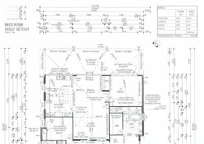
As requested, here are the plans in a more readable size!


Friday, September 9, 2011

Plans - Elevation

Front elevation

Rear elevation

Left elevation

Right elevation

Wednesday, September 7, 2011

Finally, The Final Plans

We have the final drawings and everything is looking good. The picture recess and the cavity sliding door are now drawn correctly.

As requested, here is the floor plan in a more readable size:


Related Posts Plugin for WordPress, Blogger...